
Living With Colour
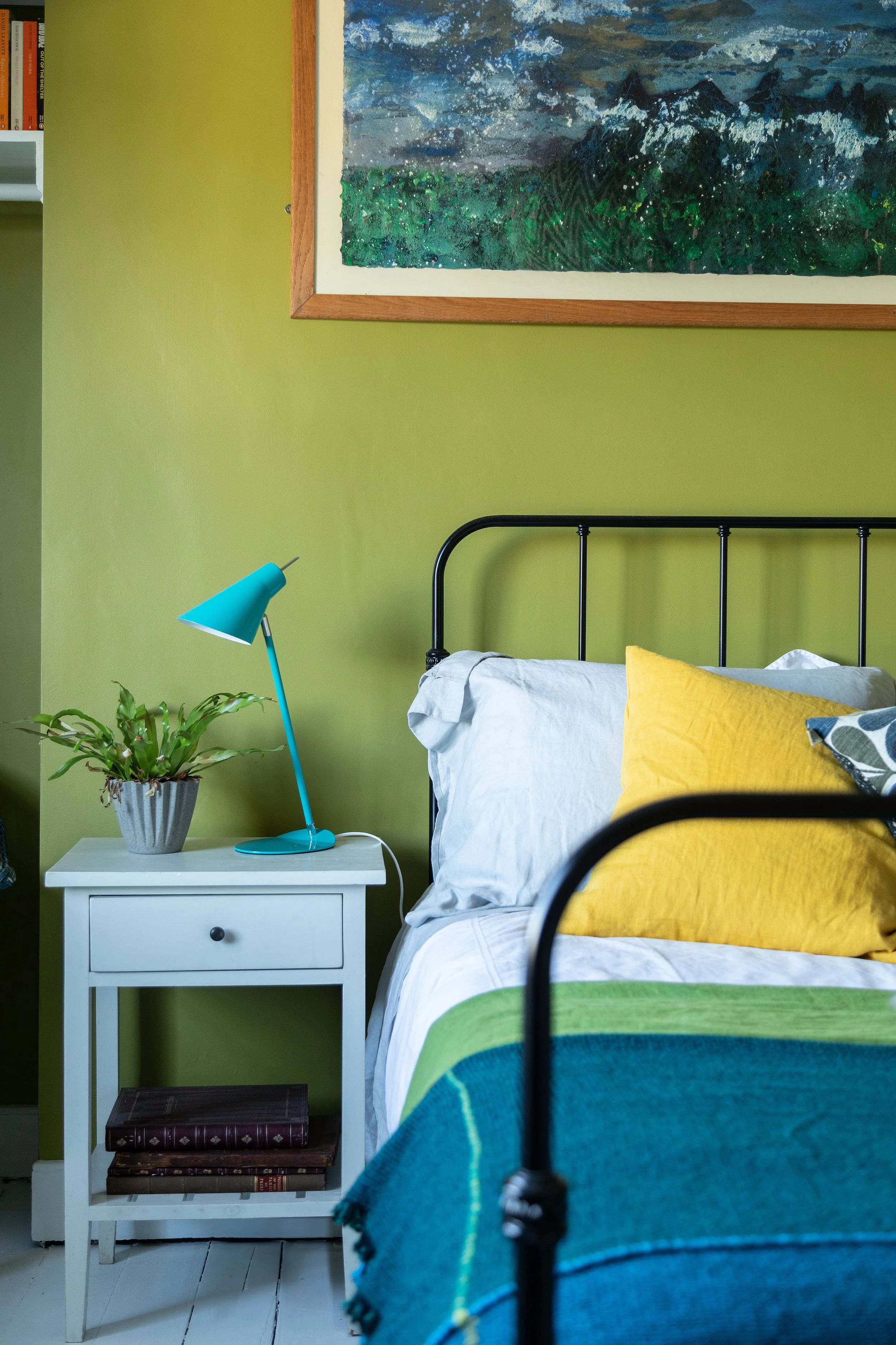
Colour is often spoken about as something to choose. A decision to be made, a finish to settle on, a moment where you finally commit to it. But in reality, colour is something we live with - long before we ever name it or paint a wall.
We notice it in the morning light, in how a room holds us at different times of day, in the way certain spaces feel calm while others never quite settle. Colour isn’t static. It shifts, softens, deepens, and responds to everything around it.
© del Renzio & del Renzio
Colour as something experienced, not selected
One of the reasons colour can feel so difficult is because we’re often encouraged to treat it as a visual choice rather than an environmental one.
Images show us finished rooms, but they rarely show how light moves across a surface, how colours change with weather and season, or how adjoining spaces affect one another. Most importantly, they rarely show how a room feels when it’s lived in rather than styled.
In practice, colour behaves much more like nature than a fixed material. It reacts. It adapts. It reveals itself slowly.
Learning to notice before deciding
Some of the most considered homes I’ve worked in didn’t begin with bold decisions or firm ideas. They began with noticing.
Noticing where the light falls.
Noticing which rooms feel restful.
Noticing the colours already present - in floors, fabrics, artwork, and the landscape beyond the window.
When we allow ourselves time to observe, colour becomes less about choosing the “right” shade and more about understanding what already belongs.
Homes that feel settled rarely rush colour
There’s a quiet confidence in spaces where colour has been allowed to arrive gradually.
These are homes where palettes feel layered rather than imposed, and where choices make sense because they’ve been shaped by how the space is used, rather than how it might look in a photograph.
This slower approach creates rooms that feel grounded, comfortable, and personal - spaces that continue to feel right as life moves through them.
Inspired by nature, curated for people
Over time, I have found nature to be the most reliable reference point when working with colour.
Outdoors, we never see single colours in isolation. Instead, we see relationships - between soft and strong, light and shade, background and accent. These relationships are what give landscapes their balance.
Bringing this way of seeing indoors allows colour to feel considered without being contrived. It’s an approach inspired by nature, curated for people.
Would you like to read more?
If you enjoyed reading this, you may like my monthly newsletter - a more personal space where I share notes on colour, interiors, and the small observations that shape how our homes feel.
It’s sent once a month, with the occasional additional note if there’s something genuinely worth sharing.